


No, Github, I don't want to explore your repositories
I always keep a pinned tab on my Github account, on the activity feed page. This page is basically a three colums layout (the classic 25%-50%-25%) and it has some serious waste of space.
I don't like how Github decide how to use the space here without leaving me the option to customize.
As a starter, the "Explore repositories" column on the right: not only the recommendations provided are badly pulled together (typical suggestion engines trap: just because I've bought a bra on your website, it doesn't mean that from now on I'm interested in all sorts of bras) but the column also wastes an entire +1000px using only a fistful of them! Looks like that space is only waiting for some GIFs or ads :^)
In addition, the left column with "my repositories" is not interesting either. I don't understand the sorting criteria (the most used?). Another 25% space wasted for nothing.
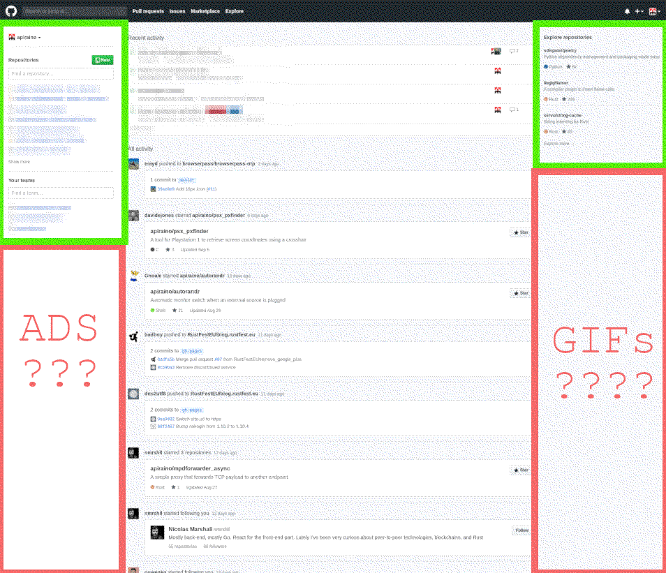
Worse, if you shrink the page size, the left column moves to the top (while the suggestions are removed) and forces me to scroll to get useful content.
To fix all this, since it's a simple HTML matter, I've installed ViolentMonkey, a spin-off of the famous GreaseMonkey extension, that allows to run arbitrary code on your browser. With two lines of JavaScript I can hide the columns I don't need.
https://gist.github.com/apiraino/f7ac1852c230b6de9b76171520d29dc4
Now I have a view over the activities feed without distractions.
If I shrink the page too much, Github changes CSS and goes mobile and "my repositories" appears again, so this script would need a bit more work to manage another CSS, but for now it's ok.